English designer Thomas Heatherwick shares his vision for Zeitz Museum of Contemporary Art Africa, which he describes as a place of imagination, writes Muhammad Dawjee.
Thomas Heatherwick (45), an English designer and founder of the London-based Heatherwick Studio, is acclaimed as an innovator in the field of contemporary design. One example is his London bus (2010) that reimagines the iconic red bus and brings delight back to the experience of everyday transport. Another example is the Olympic cauldron (2012) that celebrates the coming together of 204 nations, each represented by a single copper petal of fire.
These aren’t buildings and Heatherwick isn’t necessarily an architect, but he has been in Cape Town working on new ways to make an imaginative public space.
The Zeitz Museum of Contemporary Art Africa (Zeitz Mocaa) is a not-for-profit institution, planned as the centrepiece of the new Silo district and under construction at the V&A Waterfront. For chief curator Mark Coetzee, “a public museum’s primary role is about the public”.
He describes Cape Town as a city of corridors and explains that the museum needed to exist in a shared space in this racially and economically divided city.
“The V&A Waterfront, for us, was one of the few places we could find which is a kind of shared space.”
Coetzee describes the project as the unintentional result of several simultaneous situations: the social aspirations of the V&A, a private collection of contemporary African art owned by his client, Jochen Zeitz, that needed a home, and the ideas of the curious Englishman, Heatherwick, who spent his time crawling through an abandoned silo to explore design possibilities.
At the outset, the V&A’s decommissioned 1920s grain silo doesn’t seem like much. Despite its remarkable size, few people notice it. To Heatherwick, however, the dominant tubes ooze character.
He describes the Zeitz Mocaa as a place of imagination. He highlights the peculiarities of this building that come with age, defeating the “fandango, wibbly-wobbly bits” so prevalent in iconic contemporary museums across the globe.
A “wonky-shaped” hollow
The atrium is unusual. Coetzee describes this carved-out space as a reinterpretation of the childhood encounter many people had with a museum – where we had to pull up our socks, stick together and keep our mouths shut. Here, instead, he asked for a building that emphasised, in its interior, a strong desire.
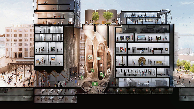
Heatherwick’s major design move is to make this atrium a “wonky-shaped” hollow in the belly of this old beast. “If we could make a space on the inside that was the organising device, so you walk in, that’s how you know how to move around the building, that’s where you meet if you get lost, that’s were the child knows to go to – otherwise we could end up with a bewildering complexity.”
Let’s imagine standing beneath the glass roof of this atrium. Daylight illuminates the space through the top of its open tubes. Where to next? It could be downward into the basement, where the processes involved in making exhibits and working on preservation and archiving become visible to the public.
Or it could be across into the permanent exhibition spaces as we scurry up one of the machine-like spiral staircases or are lifted by elevators through the galleries, up to the sculpture garden on the roof, which has one of the best views of the city and its harbour.
A new space of African imagination
The form of Zeitz Mocaa resists flatness and mediocrity at every possible opportunity and works delicately on balancing innovative design and the practical considerations of a successful museum within the budget of half a million rand. It accommodates 80 gallery spaces, nine floors, parking, restaurants, coffee shops, freight elevators, conservation rooms, storage rooms and an education centre accommodating about 100 children in two classrooms.
Coetzee says there are no offices: if we wanted to know something about any piece of work, we could simply walk to the nearest office pod (dispersed throughout the public spaces in the building) and pop our head into the mind of whoever might be using that space for the day. We could ask the financial director or the head curator: “Hey, what’s this piece all about?”
Heatherwick explains the use of glass in the top sections of the grain elevator. It celebrates the existing form of the building and is set behind the grid of concrete columns that have dominated this façade for almost a century. But the glass sections are not “guillotines of flat reflection, like every office building”. These towering pillows emit light. They are beacons that signify a new space of African imagination being celebrated and projected outward from here to the rest of the globe.
A machine for culture
How did Heatherwick Studio make what Coetzee terms this “machine for culture” a reality? Heatherwick started designing this building with his studio long before he even knew what it was going to be. He and his team started by asking how to make this dormant silo into a new public space. What emerged was “a destruction project and not a construction project”, and the drawings suggest that beneath its magnolia paint lies an experience we’ve possibly never encountered before.
Some might say this gift isn’t really what we need right now, and that maybe it could have been locally designed and less grandiose. There are also many other places where capital investment seems more urgent. But look beyond the cultural and political subtext of what Coetzee describes as an accessible museum “just like a shopping mall”, and put aside the obvious capitalist interests of its developers, and something real about the design of this building comes through. We’ll only know for sure when it is complete.
Via Mail & Guardian
Read more from Muhammad Dawjee. Twitter: @mo_d_e
PHOTO: ‘A machine for culture’: Artist’s impressions of the design by Thomas Heatherwick for the art museum at the V&A Waterfront in Cape Town.


